Are you someone who is always looking for ways to improve your handwriting and to add some funky elements to your bullet journal through lettering? Let me help you!
No doubt hand lettering can enhance any spread from your Bullet journal and the most important thing- lettering not only makes your spreads better but it also reflects your personality.
For sure we can learn anything in this era but we all do it differently and your handwriting represents you in a unique way. You can express yourself more with what fonts you choose and which font matches your mood for the day .
Today we bring you the most easy and amazing fonts , anyone can try and learn it . Some fonts might feel daunting at first but when you get into the habit of practicing them daily ,there won’t be any issue .
Supplies for Hand Lettering :
- Normal black pen.
- Brush pens .
- Sketch pens
- Highlighters
- Calligraphy pens
- Nib pens
- Ink Pens and the list is endless ……
Tips on How to Learn Hand Lettering
- Remember your childhood ? Yes, you need to do the same ! Hold your pencil and practice cursive alphabets .
- Don’t use pen or any other calligraphy equipment’s at first .
- Allow yourself to make mistakes .
- Print some Calligraphy / lettering formats and try to overwrite them.
- Practice daily , without fail .
- Take help of ruled lines , grids and dots as preferable to keep alphabets in line .
- Take inspiration from your favorite artist . Simply watching your favorite artist writing will automatically encourage you to write .
- Watch lots of tutorials on YT and Instagram.
- For dedication and motivation you can simply make a new notebook or journal for calligraphy ,where you can look back and see how far you have came . This will help you to move forward to next level.
- Last but not least – THERE ARE NO RULES ….yaaayy!! so do whatever your heart wants to create .
BULLET JOURNAL FONT IDEAS
1. Quirky Print
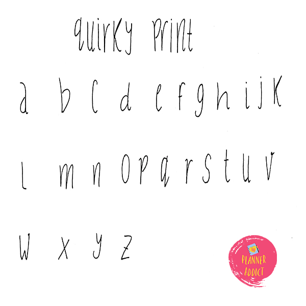
You write all alphabets of same height and a little bit of curve at the ends . This font can be used for fun mood and when you want to add more of easy going fonts . They are easy to practice and you only need a black pen .
2.Skinny Caps
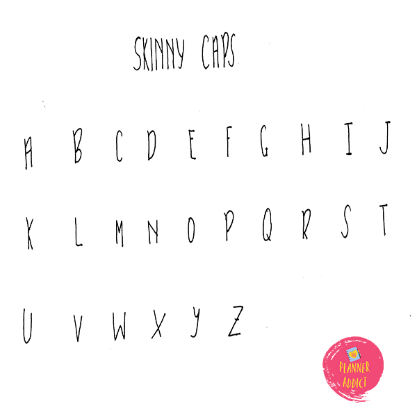
As the name suggests “skinny” it means they are very thin and you wont find any variation in thickness . They are simple and easy fonts . When you feel you want to go for a minimal style , you can always those go for this font .
3.Serif Font
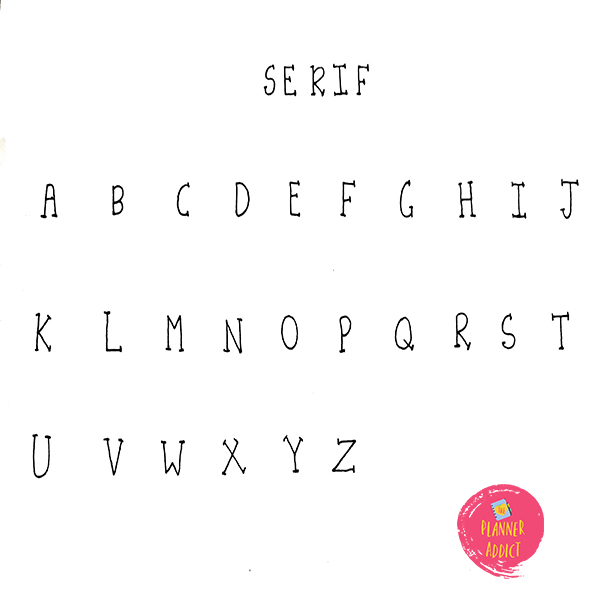
Do you feel you need to add something a bit formal yet casual and easy going then these fonts are for you . Giving a similar look to typewriter font though they are not but are easy to imitate . Sure enough to provide a printed look.
4. Sans serif
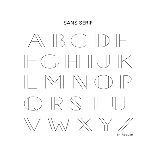
They might feel a bit difficult at first glance but actually they are very easy to write . All you need to do is simply write alphabets in capital and then add a single vertical line to the left of the character . This font looks expanded and yet regular .
5. Sphinx Font
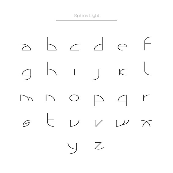
As the name says SPHINX , you can find a bit of inspiration from Greek in this font . Overall I love the simplicity of this font.
6. Block Font
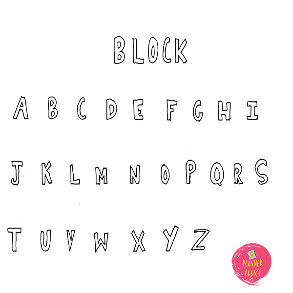
You just have to make alphabets In block form . I used this font so much in my childhood days and even today this font takes place when I want something to be bold but light too.
7. Half Block Font
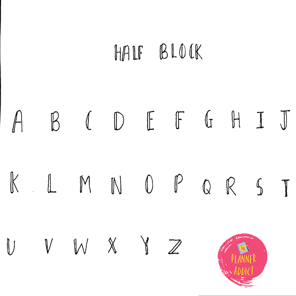
As the name suggests all you need to do is cut half the block you made previously , meaning you have to remove the double line from the right side of the characters leaving left side as it is .
8. 3 –D font
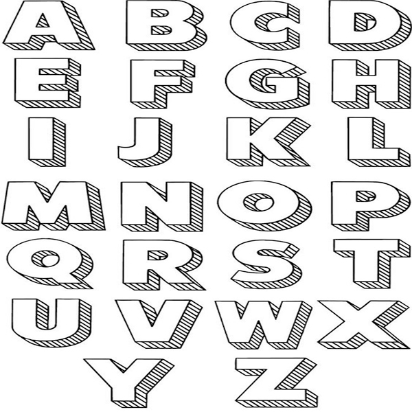
Giving a 3-D look to your Spreads is such a cool idea indeed , at first it might seem difficult to some of you but don’t worry with enough practice you will understand how you to make the third axis work in your characters .
9.Bubble font
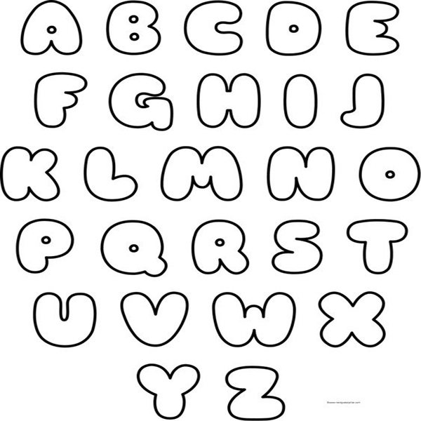
Do you do anime journal or K-pop Journals too? Then you must be familiar with this font. This font is widely used in such type of journals and is super fun and easy to make. You can really get creative with shadows and highlights of the character .
10.Typerwritter font
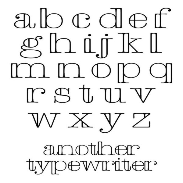
So if you really want to add that typewriter look in your headings then this font is the best . Remember the serif font ? you just have to add additional line for weight of the character on either one side of the alphabet and you are done.
11. Woodland font
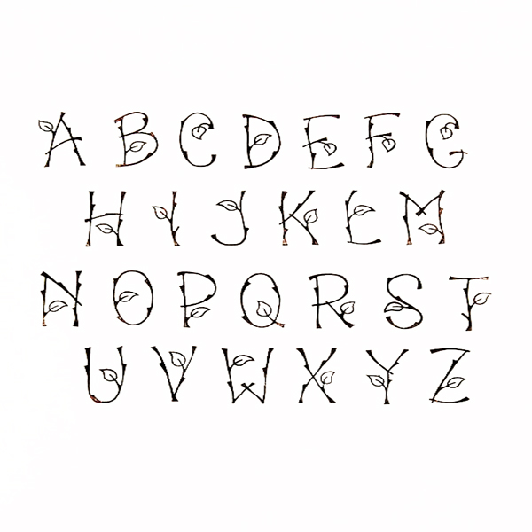
This is a customizable font and you too can create fonts like this . This particular font is inspired from the leaves . Its name shows how the creator must have got inspiration from nature and forest .
12. Faux calligraphy
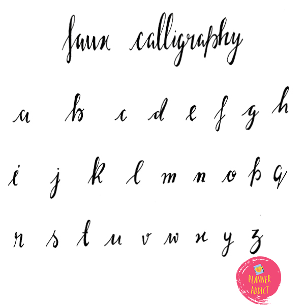
Don’t worry if you don’t want to buy expensive pens like brush pen to start for hand lettering . Faux calligraphy is the perfect replacement . All you need to do is write the characters normal and then add another thick line for downward stroke .
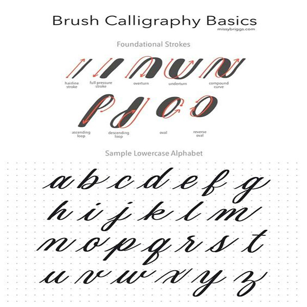
To understand the strokes , look at this example . When you move your pen upwards then its upward stroke and when you move it down its downward and adding a double line with pen to the downward stroke gives a faux calligraphy effect.
13. Brush pen Calligraphy :
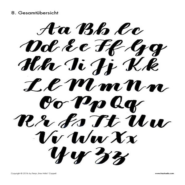
Most of you must be familiar with these fiber point brush pen with thick nibs at bottom and thinner at top . These pens lets you create very thin and thick lines with just single pen .
14. Blended Brush pen Calligraphy
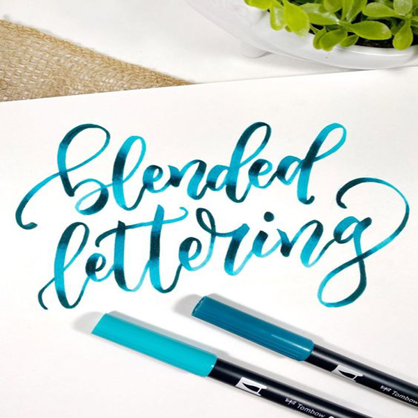
As Brush pens are water based which means you can actually blend them . You can draw half of the character with one color and complete the rest with another color , later you can use the light color of the above chosen color to blend in between the the horizon created by the two colors.
There are more ways and techniques through which you can learn hand lettering and there are so many fonts to try yet . Let me know in the comments if you need tutorials or want me to explore more with fonts . You can also tag us on Instagram by sharing your creation and we will remember to feature you !



Leave a Reply