When you look up to the most beautiful bullet Journal spreads out there, they have one thing in common – the use of colors. Colors hold immense power and are a strong visual communication tool. Colors help you represent your mood, taste, and vibe without actually saying it out loud.
But it can be hard at times to find the right color palette that matches your aesthetic taste. Not everyone is good with colors and few people even find it difficult to pick any color at the start. Don’t worry, knowing little about the basics anyone can find their perfect palette.
Color palette tutorial for planner
In this blog, i will talk about –
> Why consistent color palette is important
> How you can make your spreads stand out with the right color palette
> What color Means?
> Exploring different color schemes
> How to use a color palette in your Journal?
Why Color Palette is Important for your planner?
In the very first place you might be thinking why color palette is important anyways ?
Well its not the only important thing to consider but it is an essential element when it comes to aesthetic look of the spread .
Our brain quickly tracks similarities and is always looking for patterns and guessing the very next step. Having a consistent color palette lets the viewer know that certain content is meant to be of the same tone. A color palette helps you view your idea more appropriately and clearly. Consistency gives a clean look and makes things more consolidated.
A color palette also organizes thoughts in your mind before you put them out on paper. It becomes easier to complete the spread when you know which color to pick next . You automatically arrange and give color to specific elements based on how they would look grouped together .
How to use Color Palette in your planner ?
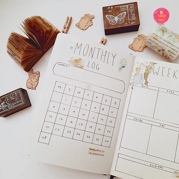
Are you following the common trends or are you picking up the colors you like ?
The most common way people pick a color palette is by following the trend and it’s a great way to break down for learning how to pick and use a color palette in your planner. When you see someone else using a certain color palette you try to pick up the patterns they had developed. You break down the spread into pieces and analyze why things look the way they are looking. These are a few micro-steps your brain takes without even making you realize.
Picking up your color palette takes a little courage when you are just starting without any basic color psychology. Sometimes we might pick 2 or 3 colors we like that are completely from a different family. You might notice that the spread looks a bit off despite your favorite colors being used because we pick colors from completely different family. I struggled with this too and the best way I could find was to align my favorite colors according to a color scheme.
What Colors mean
- Red: energy, power, passion
- Orange: joy, enthusiasm, creativity
- Yellow: happiness, intellect, energy
- Green: ambition, growth, freshness, safety
- Blue: tranquility, confidence, intelligence
- Purple: luxury, ambition, creativity
- Black: power, elegance, mystery
- White: cleanliness, purity, perfection
Four Common Color Schemes
Monochromatic
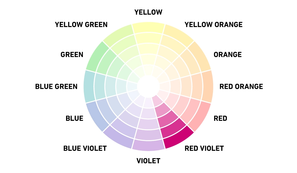
This scheme is easy to understand but hard to use at times . You create color palette of just single color by adding tint and shades to it . There can be as many shades and tint of the same hue . This color scheme might seem a little boring but if used correctly can create a pleasing effect .
Analogous
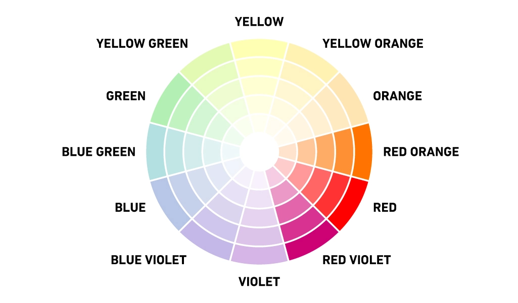
A main color and the colors from either side of it on the color wheel. They have a great level of uniformity and consistency within design . They are easy to work as there is not too much difference in hue. Instead, contrast is struck primarily through the variations in color shade, limiting any distraction away from content.
Complimentary
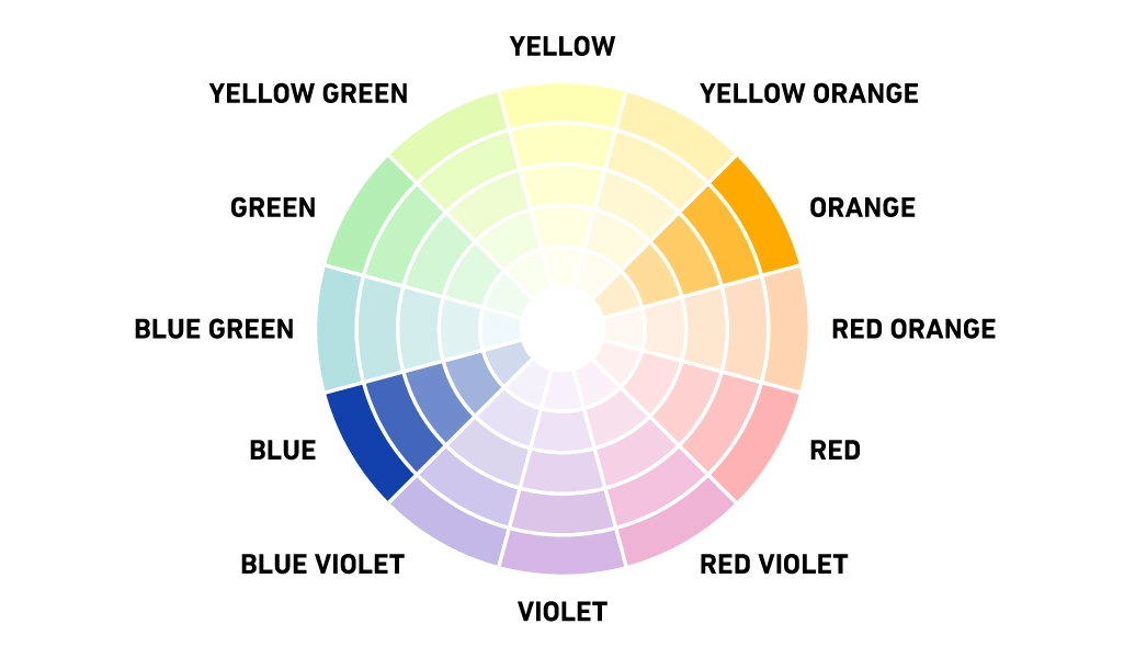
The color opposite to each other in color wheel are said to be complimentary color scheme . Like red and green , blue and orange etc . When placed side by side make colors look brighter .This is the particularly contrasting of all color schemes which attracts the most attention and one of the primary challenges when working with it is to fulfil a harmonious balance.
Triadic
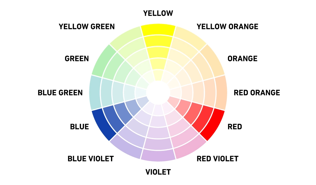
Three colors from equidistant points on the color wheel (like red, yellow, and blue). The triadic method creates a more diverse palette .To use a triadic harmony successfully, the colors should be carefully balanced — let one color dominate and use the two others for accent.
How to use Color palette in your planner?
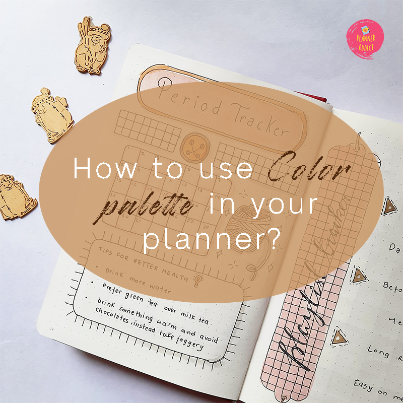
Step1 : Decide a theme – Deciding on a theme gives you clarity for your next decisions. When you work with a theme you know your directions and feel good while executing it . A theme could be anything from nature to animals . It just has to be something you love .
Step2 : Decide a color palette– After you have taken your poll on your theme , you choose a color palette that goes hand in hand with the theme . For example : A theme like DAISY might have colors like grey , yellow and green .
Step 3 : Find elements to include– Elements from a theme could be anything you like dearly . Something that you will use it again and again . For example : A broad theme like nature might have its main elements like leaves and flowers only .
Step 4: Assign Colors to elements– when everything is done , you pick up different elements in page like heading , content , any tables , doodles etc and give colors to them on basis of the color palette and their combination .
Step 5 : Breaking down the space – Here you start executing your idea by breaking down the page into positive and negative space . To create a harmonious balance and clarity you carefully decide where and how to place your colored elements .
Here are some posts you might like :
- Unlock Your Productivity and Save with Passion Planner Coupon Codes
- Is the Passion Planner Right for You? 5 Years of Lessons to Help You Decide
- Transform Your Journal : Master the Art of Vintage Themed Bullet Journaling.
- Simplify Your Self-Care: Easy Hacks & Habits for a Calmer, Happier You with Simplified Wellness
- 50+ Beautiful Bullet Journal Monthly Covers for 2024



Leave a Reply